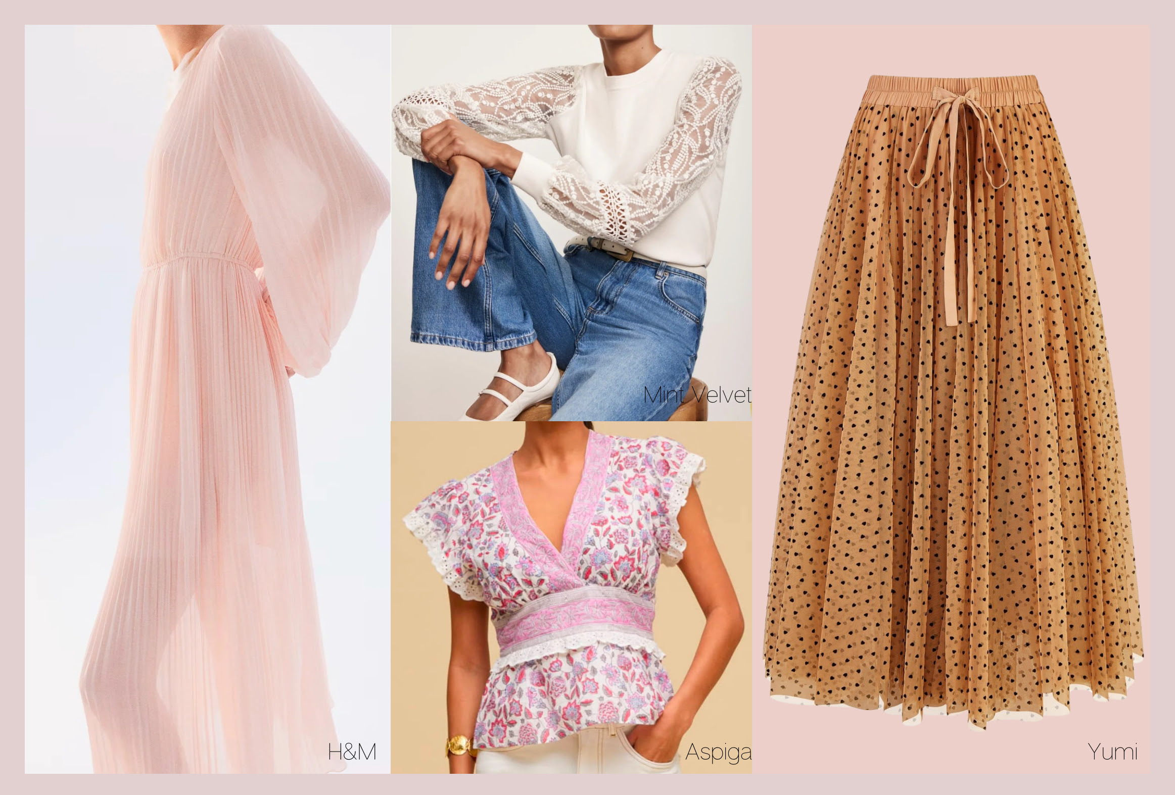
The Colorful Edition
As we head into spring, there’s a real buzz in the air – and on the high street. Shops are bursting with color right now, from bold brights to soft, muted shades. It’s seriously tempting to snap up something new! But before you do, why not take a moment to shop your own wardrobe? You might be surprised by what’s already in there, ready to make a comeback this season.
I’m talking all things color this issue, so put the kettle on and pull up a chair.
How To Wear Color
(without feeling overwhelmed)

If you’re someone who gravitates toward neutrals or feels unsure about wearing color, you’re not alone! Color can feel bold or even intimidating when you’re used to playing it safe – but it doesn’t have to be. Here are some easy ways to introduce color into your wardrobe without feeling like you’re wearing a costume:
- Start Small
Dip your toe in by adding color through accessories. Try a scarf, handbag, shoes, or even statement jewellery in one of your flattering shades. It’s a simple way to bring color into your outfit. - Use Color Near Your Face
If you’re ready to take a step further, choose colored tops, cardigans, or scarves that sit close to your face. Wearing the right colors here will brighten your complexion and make your eyes sparkle – no effort required! But, make sure the color you choose is flattering! - Anchor Color With Neutrals
If bold color feels too loud, pair it with one of your neutral basics. Someone with a light delicate look for example, could add a pop of light apricot to a much ‘safer’ light grey. It can create a balanced and harmonious look without feeling like “too much.” - Choose Colors That Harmonise With You
When color feels overwhelming, it’s often because it’s not the right color for you. Stick to your palette – the shades that flatter your skin tone, hair, and eyes. When you wear your colors, they feel natural and comfortable, not overpowering. - Prints Can Help!
A print that includes your best colors mixed with a familiar neutral can feel less intimidating than a solid block of color. Look for patterns that include shades you love, in styles that suit your personality.
Jumping Into Spring
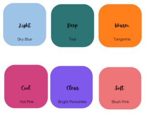
Perk up your neutrals with a fresh shade this spring! I show my clients how the addition of one or two new items can transform their wardrobe.
Lights: keep your look light and delicate; wear sky blue with stone and rose Brown.
Deeps: balance your strong look with teal which is uplifting and works well with dark navy and charcoal grey.
Warms: ‘warm up’ your neutrals such as taupe and charcoal with energising tangerine.
Cools: keep your look cool and fresh by adding hot pink to pewter and medium grey.
Clears: contrast is key, use bright periwinkle to add interest to your lighter colors such as light grey and mint. to brighten up royal blue and black
Softs: soften your neutrals such as light navy and taupe with blush pink
Print & Color:A Masterclass
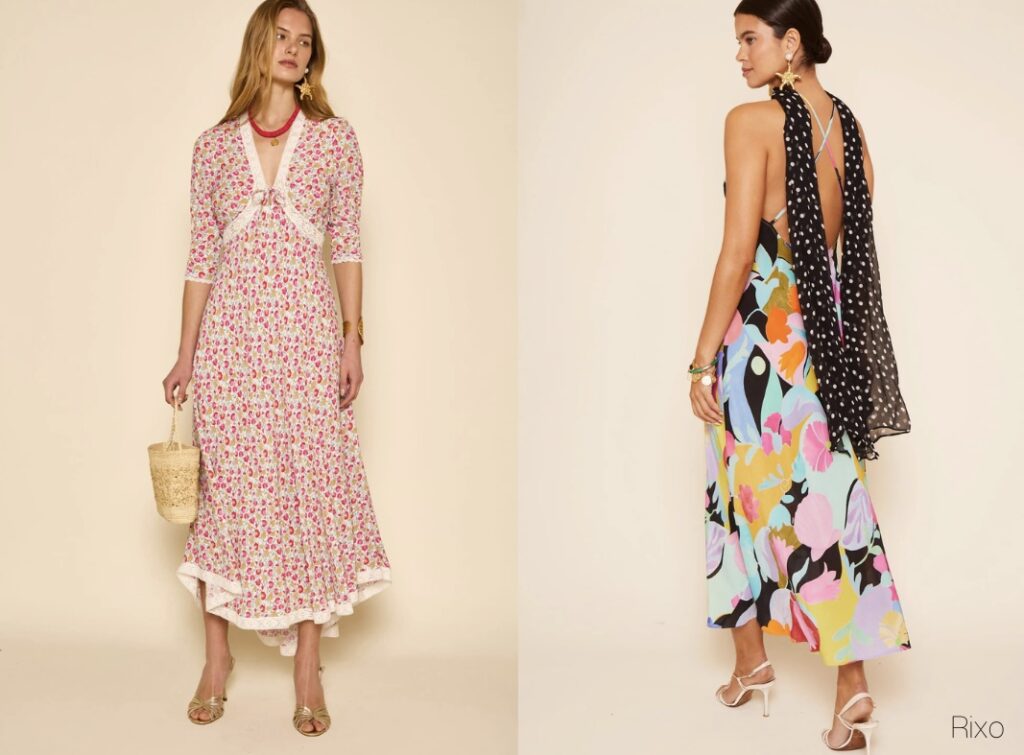
When wearing a print, especially in terms of color, there are a few key considerations to keep in mind to ensure your outfit feels cohesive, flattering, and stylish. Here are some points to consider, especially if you are slightly afraid of print!
1. Balance with Neutrals
- If your print features bold or vibrant colors, balance it out with neutral tones elsewhere in your outfit. This allows the print to be the focal point without overwhelming your look.
2. Pick Out a Dominant Color
- Identify the main color in the print and use it as a guide for the rest of your outfit. For example, if there’s a dominant red in your print, you could echo that color in your accessories, shoes, or outerwear to tie everything together.
3. Consider Your Own Coloring
- Some colors will naturally complement your skin tone better than others. If the print has colors that wash you out, consider layering it with pieces in shades that flatter you – perhaps a jacket or scarf in a complementary hue.
4. Limit Competing Colors
- If your print is already quite colorful, avoid introducing too many additional colors elsewhere in your outfit. Stick to one or two complementary shades to avoid clashing.
5. Accessories Wisely
- Accessories in colors that are present in the print will enhance the outfit. But, it isn’t necessary to match everything, in fact, it can look old fashioned. Alternatively, metallics like gold, silver, or bronze can be a neutral complement to colorful prints. Pick your best metal.
6. Cnsider Your Scale & Proportions
- A print can be used to balance your proportions and scale. For example, a long-waisted figure, horizontal prints or patterns across the torso can break up the length and create a more balanced proportion. The scale of print should be proportional to your body size: larger prints for bigger frames and smaller prints for petite figures, to avoid overwhelming or underemphasising your proportions.
There’s More Than One Shade of Mocha
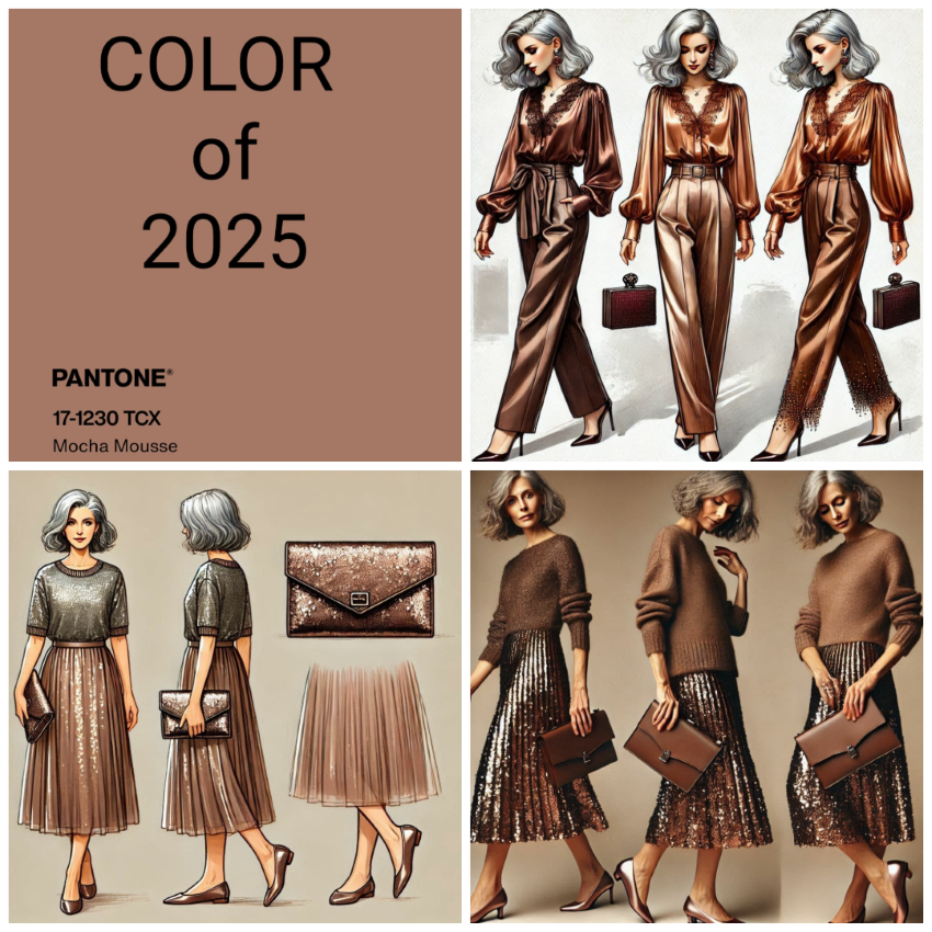
Pantone’s Color of the Year for 2025, Mocha Mousse, is already the talk of the town. This soft, earthy brown has received mixed reactions – some people love its understated softness, while others find it a bit too subdued.
Chocolate brown, its richer, deeper cousin, dominated last season and is surprisingly sticking around for spring. Brown in general can be a sophisticated neutral, but how you wear it, and the shade you choose, makes all the difference.
If you need contrast to bring your look to life, pair a deeper brown with lighter, brighter shades; think ivory and blush pink. You would further benefit from fabrics that bounce the light such as satin. For those with cooler coloring (silver or grey hair, for example), a pinkier brown version of Mocha Mousse works best, and adding contrast with shades like light periwinkle or soft rose can lift the whole outfit. If you have naturally blonde, highlighted or light brown hair, you were made for Mocha Mousse, treat it as a very useful wardrobe staple and pair it with all of your fashion colors. Whilst those with a strong, deep look (dark hair, dark eyes, any skin tone) may find Chocolate brown a more useful alternative. Finally, if you have warmth to your look, take advantage of this and add rich, golden colors to your brown.
A Quick Spring Fix
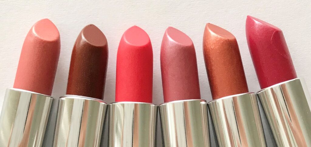
What you wear on your face is just as impactful as what you wear on your body. Get it right and you will look radiant, fresh-faced, and put together; get it wrong and you could look dull, tired, or out of sync with your natural glow. Lipstick can be such an important part of your make-up bag, because it is so impactful. It’s therefore important that you get it right! If a particular shade appears to ‘jar’ and look off, it’s most likely due to the fact that the colour isn’t right for you.

